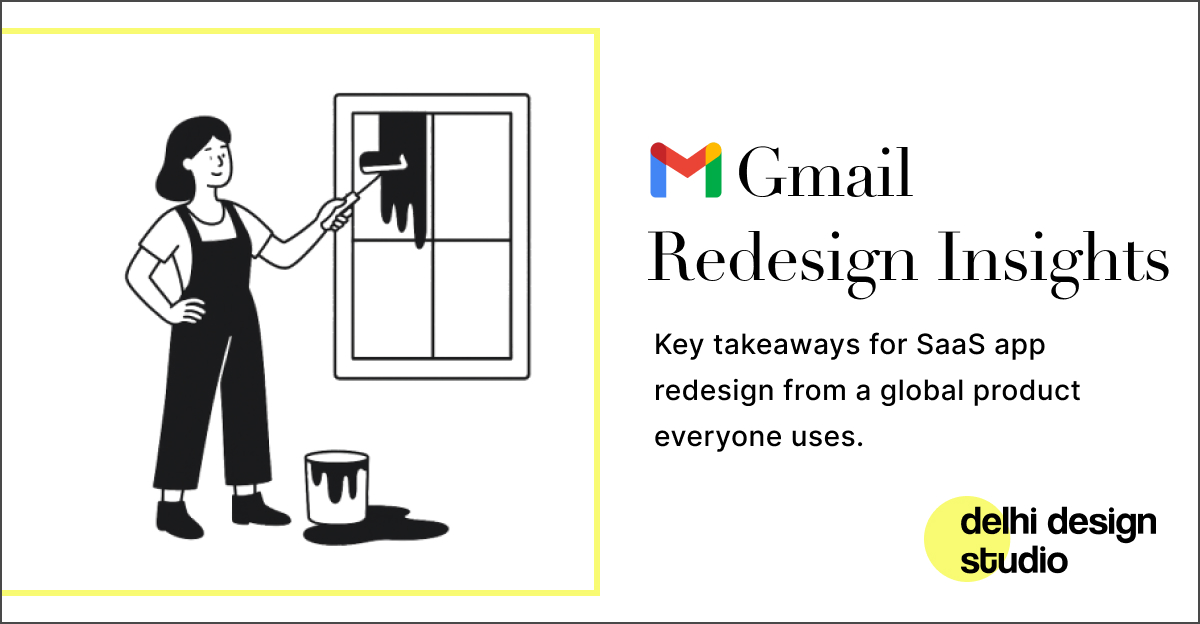
Gmail’s UX Navigation Redesign: Lessons for SaaS Apps
Delhi Design Studio – a leading India-based product design studio – often sees SaaS products accumulating feature after feature until they become a “Babel Tower” of confusion. For many Indian startups and enterprises, this happens when new modules (chat, analytics, settings, etc.) are bolted on without a cohesive plan. Support tickets spike, users complain they “can’t find anything,” and growth metrics stagnate. These are clear signals that a SaaS app redesign is needed. In early 2022, Google faced the same issue with Gmail. Its simple email interface had become cluttered by added chat, video and workspace tools. The way Google solved this offers actionable design lessons for any SaaS team.
Recognise the Redesign Triggers
These “SaaS Babel Tower” symptoms remind us it’s time for a UX navigation redesign. If your product feels cluttered or users waste time just finding basic actions, it’s the right moment to rethink the interface – just as Google did with Gmail.
Gmail’s UI Overhaul: From Email to Collaboration Tool
Google announced in January 2022 that it would roll out “a new integrated view” for Gmail, uniting email, chat, Spaces and Meet in one sidebar. By mid-2022, the update arrived: Gmail’s left-hand menu was transformed. Now a large collapsible sidebar hosts icons for Mail, Chat, Spaces, and Meet. Delhi Design Studio’s UX experts note this clearly signals which app you’re in and keeps functions separate. The new menu shows you’re in an email tool, while Chats, Spaces, and Meet are divided into their own sections and work uniformly.
This navigation redesign effectively turned Gmail into a collaboration multitool. Users who purely wanted email no longer had Meet or Chat windows blocking their view. For those who do want meetings and messaging, switching between them is now one click away. The result was an interface where each major tool had a dedicated section, reducing confusion.
Some users initially grumbled – the sidebar looked like an intrusive “banner” for chat and Meet. But crucially, Google built in flexibility. In Settings, users could collapse or hide the new panes if they didn’t need them. This underlines a key point: allow customisation. By giving users control (e.g. a “hide chat” option), Gmail turned early frustration into a positive experience.
Actionable Takeaways for Your SaaS Redesign
Learning from Gmail’s example, here are practical principles for a successful SaaS UI overhaul:
By following these guidelines, your SaaS redesign can improve usability without alienating customers. Each point above aligns with Delhi Design Studio’s philosophy: build scalable, user-friendly interfaces that respect what users expect.
Scalable, User-Friendly Design by Delhi Design Studio
Whether you’re an Indian startup or an established enterprise, Delhi Design Studio is your partner for SaaS app redesign. As a top SaaS UI design agency in India, we’ve guided many teams through enterprise UX redesign projects. Our India-based product design studio blends global UX best practices with local market insights. We focus on scalable, user-centric solutions – from navigating sprawling features to crafting intuitive collaboration UIs.
For example, when a Mumbai-based SaaS platform needed a UX navigation redesign, we took inspiration from cases like Gmail’s: grouping features logically and allowing user choice. The result was a cleaner, more intuitive dashboard that accelerated user onboarding.
In your next product refresh, let Delhi Design Studio apply these lessons. We’ll ensure that your interface enhancements – whether it’s a collaborative app UI redesign or a simple facelift – truly benefit your users. Reach out to us to lea