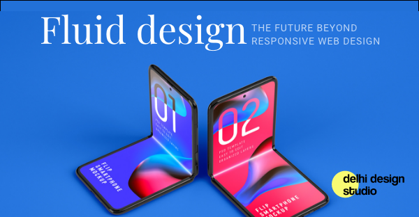
Fluid Design: The Future Beyond Responsive Web Design
Responsive design is dead. Long live fluid design!
At our UI/UX design company, we’ve been reflecting deeply on the evolving landscape of digital interfaces. For years, responsive web design has been the cornerstone of creating seamless user experiences across different devices. But today, with the advent of foldable screens, rollable displays, and dynamic viewports, traditional approaches are starting to show their limitations. It’s clear: if we want to future-proof our designs and deliver truly user-centered experiences, fluid design is the way forward.
Responsive Design vs. Fluid Design: What’s the Difference?
Let’s quickly refresh:
Responsive design adapts layouts based on fixed breakpoints (think desktop, tablet, mobile sizes).
Fluid design focuses on continuous flexibility. Instead of adjusting at set points, it seamlessly adapts to any screen size, shape, or orientation — whether it’s stretched, folded, rotated, or resized dynamically.
Adaptive design deserves an honorable mention too. It involves creating multiple distinct layouts for different devices. While still useful in niche scenarios, it’s generally discouraged today — particularly because it can negatively impact SEO, accessibility, and maintenance.
For maximum scalability and performance, modern UI/UX agencies prioritize delivering a single HTML structure across all devices, enhancing the user experience dynamically through smart CSS techniques.
Why Responsive Web Design is No Longer Enough
Responsive web design made sense when devices were predictable — laptops, tablets, phones with standard screen sizes.
But foldables are shifting the paradigm:
Dual states: A foldable device isn’t just one form factor — it can transition between a compact phone and an expanded tablet. Your layout must function beautifully during, before, and after these transitions.
Dynamic viewports: Users can now interact across panels, split-screens, or tent modes. Unlike the rigid structure of responsive layouts, fluid design naturally adapts to continuous transitions.
New user behaviors: Foldable users are already innovating — multitasking, partial folds, dual app usage. Your interface must anticipate and gracefully handle unexpected interaction styles.
As any forward-thinking UI/UX design agency knows, embracing flexibility isn’t just optional anymore — it’s essential.
How to Integrate Fluid Design into Your Process
Moving from responsive to fluid thinking starts at the design stage. Here’s how our UI/UX experts recommend you approach it:
At their core, websites are composed of boxes — divs, cards, sections. Tools like Figma, Adobe XD, and Sketch allow you to:
Group related content into logical, flexible containers.
Maintain consistent spacing, padding, and margins, reflecting CSS best practices.
Anticipate how elements expand, shrink, or reflow based on changes in screen dimensions.
Using a modular, box-based approach doesn’t just aid flexibility — it also makes developer handoff smoother and can streamline no-code workflows (think Figma to Webflow plugins).
Instead of locking content into rigid templates:
Use fluid grids rather than fixed-width columns.
Set max-widths and min-heights, but avoid absolute pixel values when possible.
Emphasize relative units like percentages, vw (viewport width), vh (viewport height), and rems.
This keeps your content flexible and adaptable, ensuring beautiful, functional layouts — no matter the device.
3. Focus on User Intent and Context
Design isn’t about devices — it’s about human needs. Consider:
How will users multitask?
What happens when users switch from portrait to landscape mid-task?
How can you prioritize accessibility across a wide range of interactions?
By designing around intent, not just screen size, you ensure your experiences remain intuitive and frictionless — a key principle for any successful UX design company.
Fluid UX/UI design ensures you're ready for whatever comes next — because it’s not about controlling screens, but adapting beautifully to change. As a leading UI UX agency, we believe it's time to design for possibilities, not just devices.
Key takeaways for UI UX Companies
Responsive design is not obsolete — but it's no longer sufficient by itself.
Fluid design provides continuous adaptability rather than relying on fixed breakpoints.
Foldable devices, dynamic interfaces, and wearable tech demand flexibility-first thinking.
Design based on the box model, content flow, and user intent to stay ahead of emerging technologies.
Future-proof your designs by building modular, flexible systems that can handle the unpredictable.
Ready to future-proof your product?
Contact our award-winning UI/UX design team today!