
Fintech Onboarding UX: How to Cut KYC Drop-off Without Cutting Compliance
 By Neelam, Founder · 16 years in e-commerce & fintech UX13 November 20266 min read
In short: Most fintech drop-off happens before or around identity checks: too many questions too early, missing documents and confusing hand-offs. Users will accept thorough checks for financial services — if the flow explains itself and never wastes their effort.
What the research says
- Signicat's "Battle to Onboard" research puts financial application abandonment at 68% of consumers (cited by Flat Studio). In the 2022 edition, 38% abandoned because they did not have the right identity documents to hand and 30% because the process was too complicated (Zigment — note these figures are from 2022, Europe).
- A record 70% of financial institutions said they lost clients in the past year because of slow onboarding (Fenergo survey, reported by WealthBriefingAsia).
- 80% of consumers said they would spend more time on a thorough identity check for banking and financial services (Jumio 2025, cited by Zigment). Users don't hate checks; they hate wasted effort.
7 design patterns that reduce drop-off
1. Tell people what they'll need before they start
"You'll need your Emirates ID or passport and 3 minutes." A checklist screen up front stops the "I don't have my documents" exit halfway through.
2. Ask only what this step needs
Collect the minimum to create the account; move the rest to after the user has seen value. Each extra early field is a new reason to leave.
3. Keep verification inside your product
A sudden redirect to a different-looking third-party screen feels like a phishing risk. Embed the verification step and keep your branding, language and tone.
4. Show progress and save it
A clear step counter and auto-save mean a user interrupted by a phone call comes back where they left off, not at step one.
5. Write errors that fix themselves
"Photo too blurry — hold your ID flat near a window" beats "Verification failed". Re-uploads are where patience runs out.
6. Explain why you ask
One line under sensitive questions — "Required by the Central Bank for all loan applications" — turns suspicion into compliance the user understands.
7. Design the waiting time
If approval takes time, say how long, what happens next and how they'll be told. Silence after submission is when users apply elsewhere.
From our work
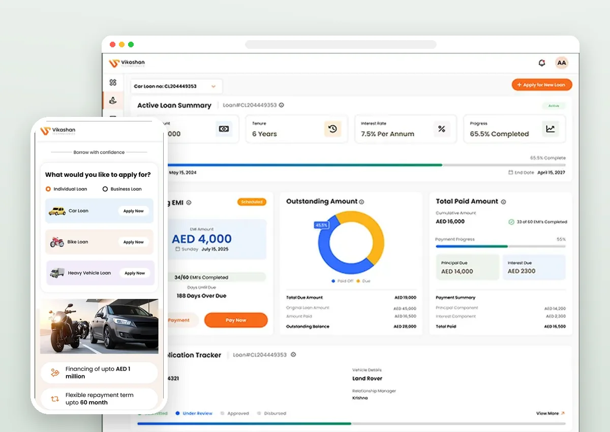
We designed Vikshan, a digital loan platform for a bank in Dubai, applying these patterns to onboarding, loan selection and repayment tracking. Our founder has 16 years of fintech and e-commerce product design experience, including Paytm and BusinessNext.
Sources
- Fintech onboarding UX and KYC drop-off — Flat Studio
- Fintech statistics 2026 — Zigment
- Onboarding abandonment survey (Fenergo) — WealthBriefingAsia
FAQ
Why do users abandon fintech onboarding?
The most common reasons are not having the right documents ready, processes that feel complicated or slow, too many questions too early, and confusing hand-offs to third-party verification screens.
Can you reduce KYC drop-off without weakening compliance?
Yes. Most improvements change how steps are explained, ordered and designed — not which checks are done. Users accept thorough checks for financial services when the flow is clear.
Do you design fintech apps for clients outside India?
Yes. We designed a digital loan platform for a bank in Dubai and work with clients in the UAE, UK, US, Canada, Australia and Singapore.
Building a fintech product?
We design onboarding, KYC and loan journeys that users finish — for banks and fintechs worldwide. Book a free 30-minute call.
Book a call