
Mobile-First UX for Indian D2C Stores: 12 Fixes Before You Spend on Ads
 By Neelam, Founder4 November 20262 min read
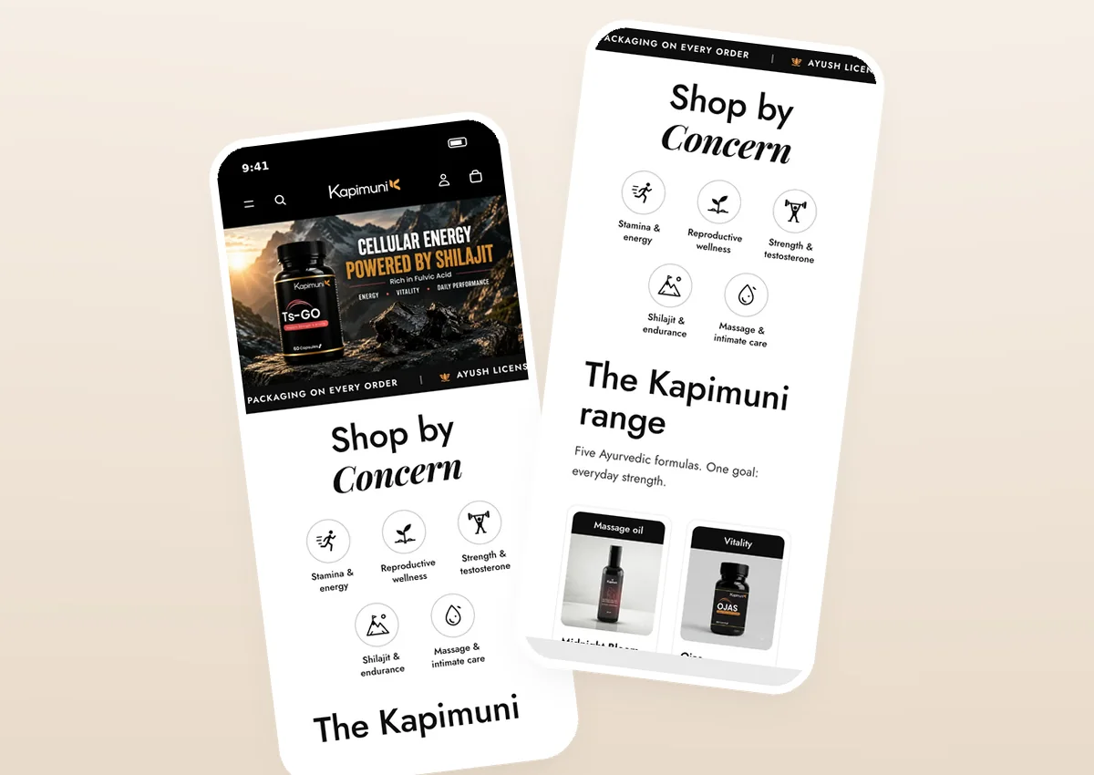
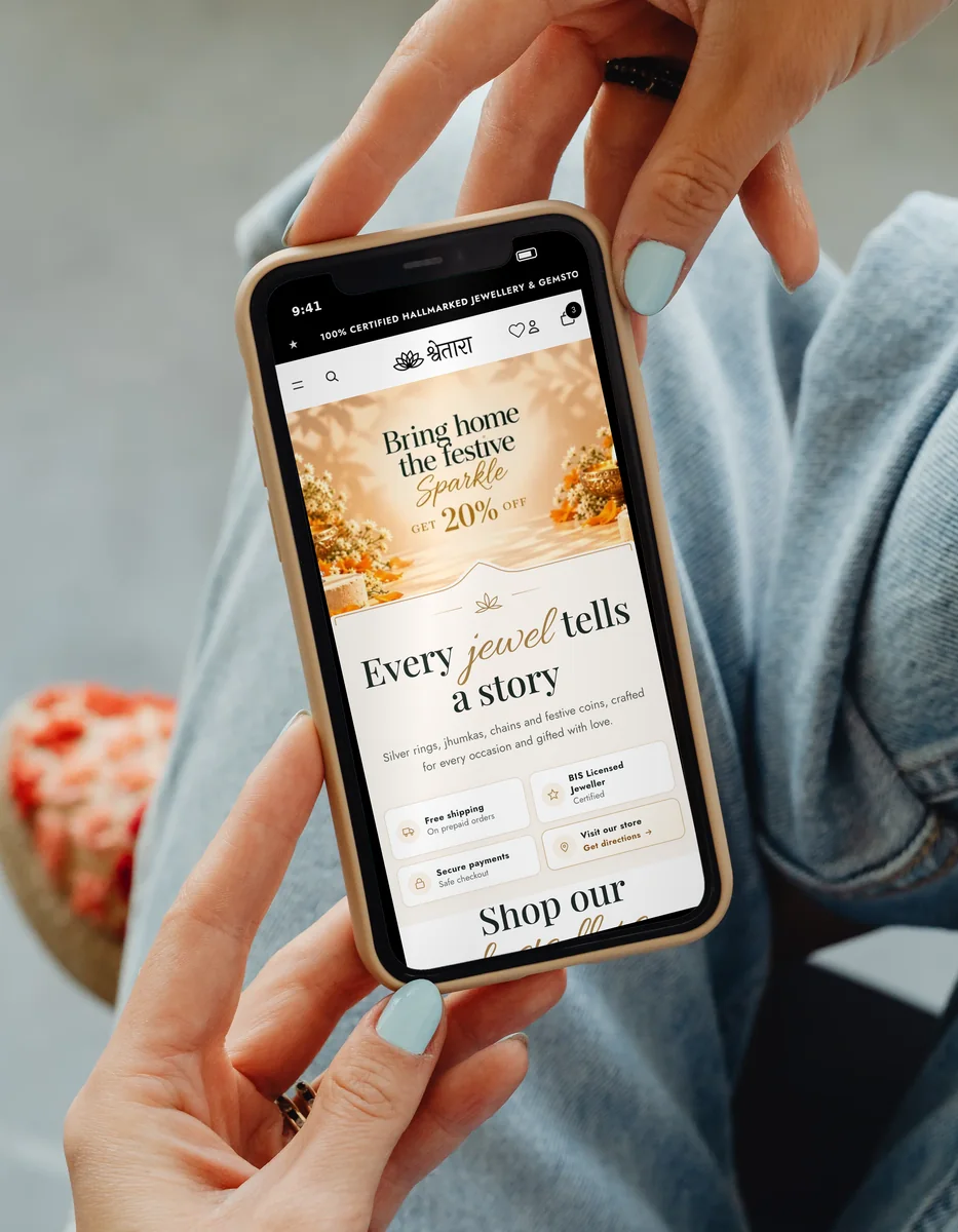
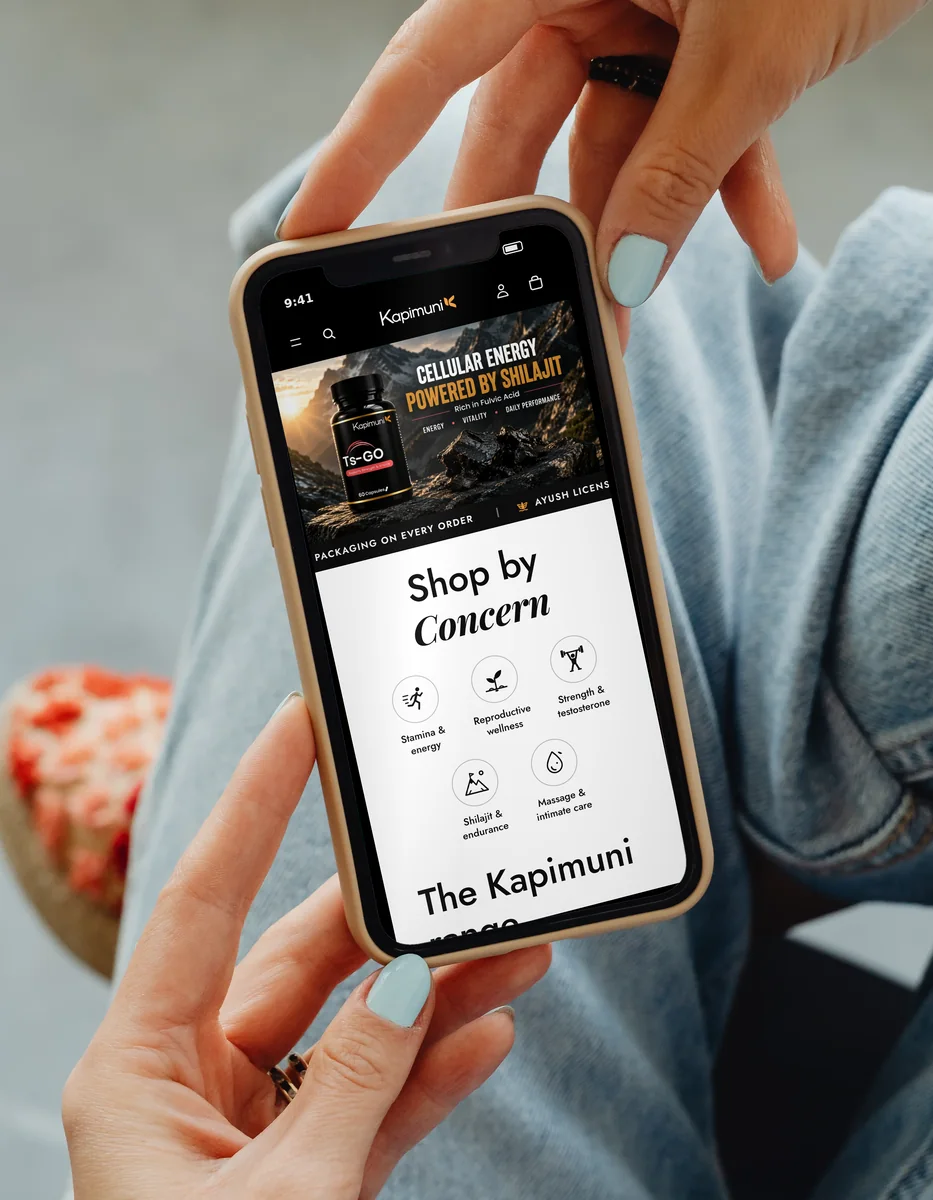
In short: ads bring people to your store; mobile UX decides whether they buy. These are the 12 checks we run on every D2C store before launch — the same habits behind stores like Shwetara, Dear Muscles, Kapimuni and Satv Aura, which together take 1,050+ orders a day.
Why mobile-first, not “mobile-friendly”
Mobile-friendly means the desktop site doesn’t break on a phone. Mobile-first means the phone screen is designed first, because that is where your Instagram, WhatsApp and search traffic actually lands. The difference shows up in thumb reach, how much text fits above the fold, and how many taps it takes to pay.
Speed and first screen
- Show the offer in the first screen. What you sell, for whom, and one clear button. No auto-sliding banners that hide the message.
- Make images light. Use modern formats (WebP/AVIF), correct sizes and lazy-loading below the fold. A heavy hero image is the most common reason a store feels slow.
- Keep pop-ups out of the way. A discount pop-up in the first second blocks the page the visitor came to see. Delay it, or use a small bar.
Navigation and discovery
- Shop by need, not just by category. “Shop by concern”, “Gifts under ₹2,000”, “Shop by intention” — match how people think, not how your warehouse is organised.
- Search that forgives. Typos, Hinglish and synonyms should still find products.
- Thumb-friendly menus. Big tap targets, the most important links first, and a visible cart and WhatsApp.
Product page
- Price, variant, button — together. The shopper should never scroll between choosing a size and pressing Add to Cart.
- Answer the doubts next to the button. Delivery time, return policy, COD availability and reviews, in one glance.
- Real photos at real scale. On-hand, on-body or in-room images remove “how big is it?” questions. For custom products, show a live preview — like Satv Aura’s bracelet builder.
Cart and checkout
- No surprises. Shipping and COD charges should be visible before checkout, not after.
- Fewer fields. Auto-fill pincode to city/state, keep the phone number first, and remove anything you don’t need to deliver.
- Recover gently. Abandoned-cart reminders on WhatsApp or email bring back people who were interrupted — not just people who weren’t sure.
How to use this checklist
Open your store on a mid-range Android phone on mobile data, and try to buy one product without help. Every time you hesitate, write it down. That list — not a redesign — is usually the fastest path to more orders. If you want a second pair of eyes, our UI/UX design team runs exactly this audit.
FAQ
Why should a D2C store design mobile-first?
Most shoppers who come from Instagram, WhatsApp and Google ads arrive on a phone. If the store is designed for desktop and squeezed onto mobile, the most important screen for revenue gets the least attention.
What is the quickest mobile UX win for an online store?
Usually the product page: a clear price, an obvious size or variant choice, one primary button visible without hunting, and trust details (delivery time, returns, reviews) right next to it.
Should I fix UX before running ads?
Yes. Ads send traffic; UX decides how much of it converts. Fixing obvious friction first makes every rupee of ad spend work harder.
Want a UX audit of your store?
We design and build Shopify experiences that sell — and get found on Google and AI search. Custom Shopify coding in 7 days, or a full refund.
Book a call